

.005 I'm Absolutely Judging
.005 I'm Absolutely Judging
Who among us can help but judge a book by its cover?

Last month, I was browsing the selection at the North Figueroa Bookstore in Highland Park with a friend, when I came across a collection of poems by early 20th-century lyrical poet Edna St. Vincent Millay. I wasn’t planning to buy anything, and I don’t have a particular fondness for St. Vincent Millay (aside from holding the opinion that she has one of the very best names in poetry), but the book itself — the object — caught my eye and would not let me go.
To my sensibilities, the cover is the epitome of beauty — a woodcut print and a letterpress-set typeface feature in an elegant oxblood on a field of khaki-cream.
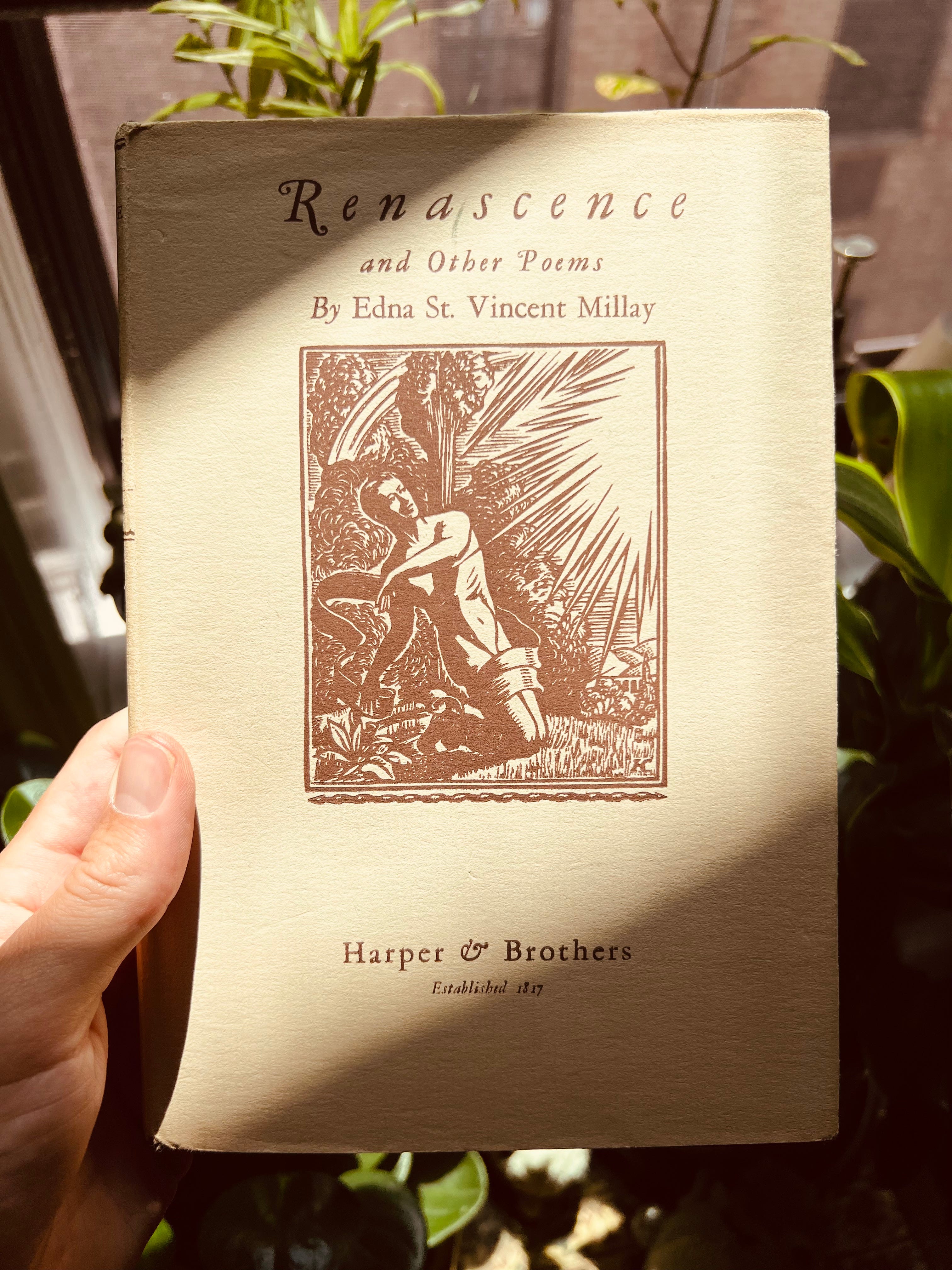
I can admit that this book design appeals to my taste specifically, but I’ll also stand firm on the argument that it is good design: it limits its palette to only two colors; it doesn’t shy away from negative space; and the image selected is evocative, making a promise to the potential buyer of what the poetry inside will feel like.
The same cannot be said for much book design today. Are you ready for a jumpscare?
…
Ok here it comes…
I am certainly not the first critic to query the trend of book cover design that could be described as everything from algorithmic to sophomoric to lazy to straight-up bad. For deeper dives into this phenomenon, check out this or this.
Broadly speaking we see three levels of design language present across the industry — 1) design chosen for an individual release; 2) design cohesion within an author’s titles; and 3) a house-wide design language. Let’s speak about each briefly.
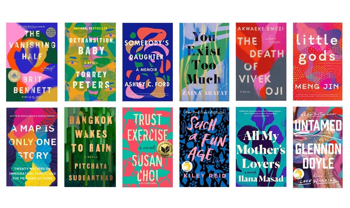
I’d equate the design-per-book level of cover design to DTC brands designed by agencies such as Gin Lane and Red Antler through the 2010s. In other words, the Caspers, the Warby Parkers, the Glossiers of book branding. They don’t all intentionally share a style, but because of trends and either bureaucratic or algorithmic decision-making, we end up getting cover after cover that sort of all look the same.
Here’s the thing: cover design cohesion doesn’t bother me when it’s intentional; if you told me all of the books above were by the same author, I’d understand and maybe even say job well done. The problem is when covers for books by different authors released by different publishers all start to blend together. Things get muddy.
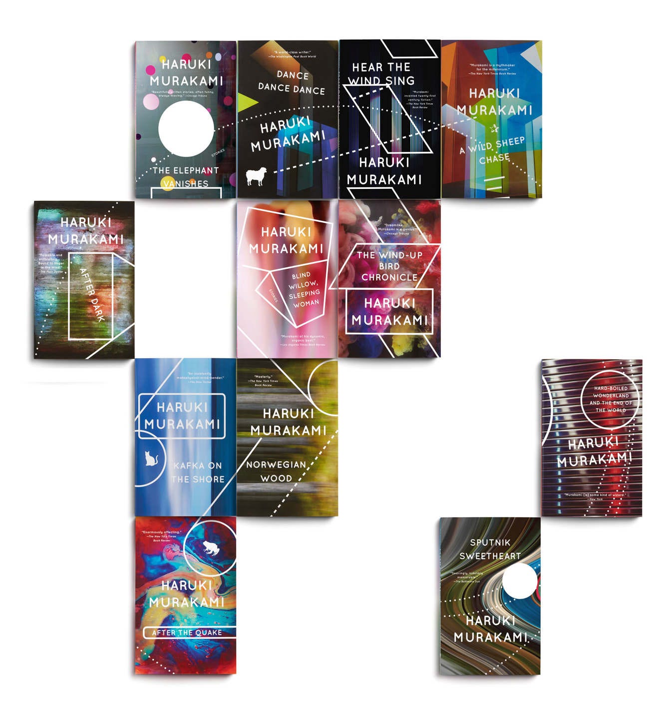
Generally speaking, after one book is out, an author’s subsequent titles will feature some modicum of similarity in design ethos. Of course, books in a series will share a design ethos, but even for authors whose books stand alone, the same designer will often work on multiple cover designs, forming cohesion across titles.
In 2015, Penguin Random House commissioned a new look for Haruki Murakami’s English translation paperbacks. Designer John Gall conceived a series of covers using photographs by the Japanese artist Hideo Anze, who shoots abstract images of lights in Tokyo on his iPhone.
But what I really want to talk about is book cover design that follows parameters and aesthetics set by the publishing house. This level of design direction privileges the ethos, aesthetic, and clout of the publisher, ignoring the book’s content.
Launched in 2009, & Other Stories is an independent British publisher known for literary fiction. Their first 10 releases shared the same cover style — a sort of minimal graphic language reminiscent of Joseph Heller’s Catch-22 or the ‘60s James Bond title sequences designed by Studio MK12.
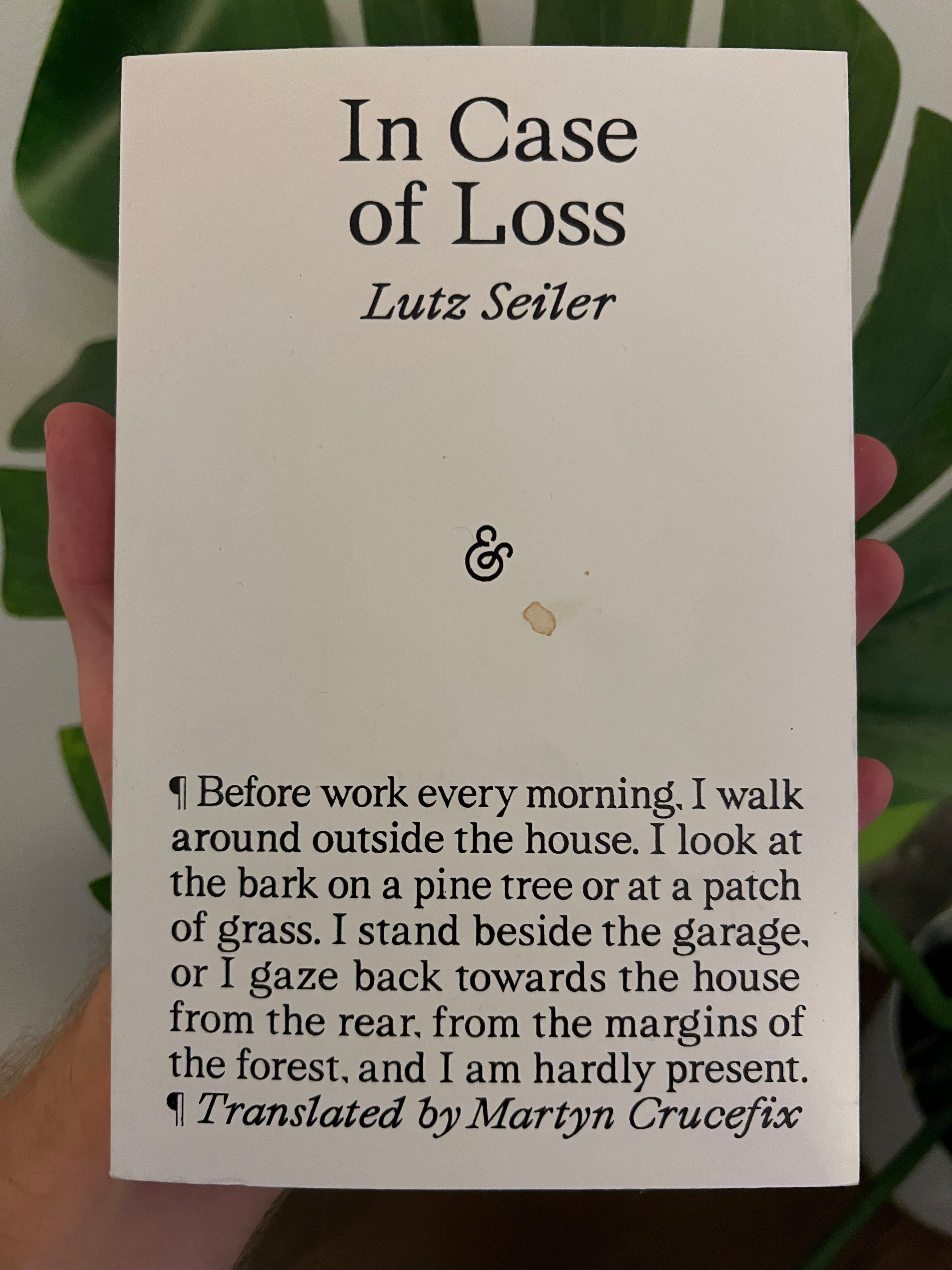
After the first couple of years, & Other Stories abandoned this style for a decade until September 2023 with Lutz Seiler’s Pitch & Glint, which introduced a new style that has become instantly recognizable: a pure white field punctured by the ampersand colophon, with title and author above, and an excerpt below, styled with a playful nod to the publishing process with the visible paragraph symbol.
A few publishers, including NYRB and Semiotext(e), allow variation in the cover design, but adhere to a strict style on the spines. Hedi El Kholti leads design at Semiotext(e), the publisher known for translating French critical theory into English under their Foreign Agents series and for publishing many influential women and queer authors under their Native Agents series. The spine of every Semiotext(e) book is white with title and author in bold impact black font. Fiction titles are in all caps, while critical theory, essays, and memoir use title case.


Finally, Fitzcarraldo Editions is perhaps the ultimate design-focused publisher. This British publishing house is famous for its minimalist book design — white text on Yves Klein blue for all fiction titles; the inverse for non-fiction.


The radical simplicity of this design approach generates endless possibilities for memes, remixing, and earnest love. It’s sort of the brat approach to design.
What psychology is at play in book design?
Taste communities form around publishers like & Other Stories, Semiotext(e), or Fitzcarraldo.
Like adherents to smaller, non-Kering or LVMH fashion brands, disciples of presses with tight design styles harbor an implicit trust in the books they put out. New releases under these imprints automatically gain a cache purely by dint of association with said publishing house. They are the Yohjis, Rick Owens, and Gannis of the publishing world.
In a culture where the media we consume is not only linked to our personal taste, but also to our sense of personal style, media as object gains more importance. You know the real film heads who pay for premium Letterboxd so they can select their own posters for the films they log; the music lover whose vinyl collection is prominently displayed in their home; and the reader who will only leave the house or post a pic with a book that has an aesthetically appropriate cover — in other words, that melds with their personal style.
What is your favorite book cover?
Fortnight Ahead: July 1–14
Tuesday, July 2: Launch of Paul’s Cut by Paul Maffi. | 6 pm at Mast Books, NY. Free.
Friday, July 5: Wonder Press presents: Launch of Hard Crush by Sarah Yanni, feat. Grace Byron, Matthew Bussa, Jacke Colquitt, Sammy Loren, Lena Melillo, and Terry Nguyen. | 7:30 pm at Powerhouse Arena (28 Adams St.), Brooklyn. Free.
Sunday, July 7: Poetry in Elizabeth Street Garden. For July 7th, the theme is “breath.” Poets may submit two to three poems to art@elizabethstreetgarden.com. Selected poets will be notified the day before. | 4 pm at Elizabeth St Garden, NY. Free.
Sunday, July 7: Poetic Research Bureau presents: Launch of Two Signatures by Sara Ellen Fowler, feat. J. Jennifer Espinoza and Rocky Caleshu. | 5 pm at 2220 Arts + Archives, LA. Free.
Tuesday, July 9: Launch of More, Please by Emma Specter. | 7 pm at Skylight Books, LA. Free.
Saturday, July 13: Kristen Lopez Presents Drop Dead Gorgeous. | 1 pm at Los Feliz 3, LA. $13.
Saturday, July 13 + Sunday, July 14: New York City Poetry Festival. | 11 am–6 pm at Nolan Park, Governor’s Island, NY. Free.