


Issue 30: The New Periodicals
Examining the place of magazines in culture

It’s March, and the thirtieth issue of High Noon. As a bit of a milestone celebration, I’m introducing a new alternative design.
Inspired by the aesthetic evoked by the publication name, the new banner is derived from international maritime signal flags.

This week, it’s a High Noon about my long-abiding love… magazines! I’m currently reading Cat Marnell’s memoir, How To Murder Your Life, and remarking on the insight into the golden era of magazines. Between her very low lows, she seems to not be able to quite believe that this is really happening to her. An actual magazine editor! I wonder how much that type of sentiment persists…
That’s all from me for now. Enjoy the issue and see you at noon, sailors! 🌞
xx SCREMES (Shawn)
The Roundup
Links to the week’s top stories
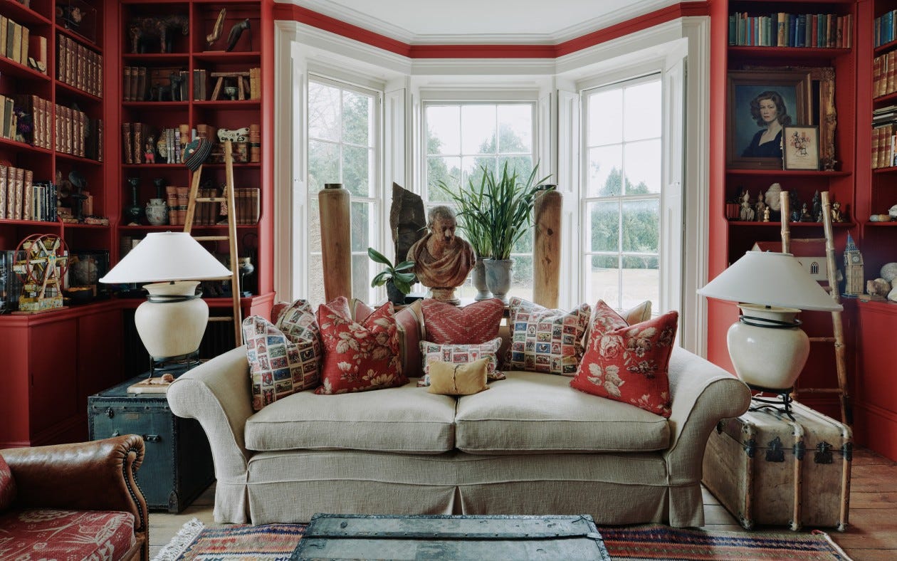
Heidi Bivens reigns supreme over the realm of modern costuming. • New Collectors is democratizing art collecting. • Dasha Nekrasova’s directorial debut delights at Berlinale. • Instagram’s new Live Rooms aim to compete with Clubhouse. • Our whole ecosystem, more or less, runs on snitching. • Designer Martin Waller’s Georgian home blends understated elegance with international eclecticism. • At the height of a podcasting boom, will Hollywood improve or ruin the medium? • Hari Nef recounts the anguish and ecstasy of being mistaken for cis. • Ideology aside, Americans are essentially (psychologically) conservative.
The Long Read
The week’s keynote story
Only going to read one thing? Read me.
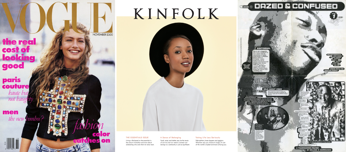
The New Periodicals | Shawn Cremer | High Noon Original
1988 to 2008 were the pinnacle years of The Glossy. Two full decades of the reign of Condé and Hearst — a true bubble that, like so many others, expanded to its most opulent, gilded extremes in the heat of the 1990s. It began with the arrival at Condé Nast of Anna Wintour.
For two decades, she held sway over both the actual business of the most highly regarded glossy magazine, as well as the public perception of the entire industry. Numerous tales of life in publishing glamorized the world, with 2006’s The Devil Wears Prada putting the cherry on top. (Or perhaps, since this is Condé we’re talking about, the bow on the Ladurée box, hmm?)
Then, in 2008, the financial crash caused troves of The Glossies to fold, the less-than-glamorous financial reality of the publishing industry revealed itself as advertisers fled. And all of this was compounded by the rise of the bloggers, and shortly thereafter the Instagram influencers. The downfall of The Glossies had begun.
Kinfolk, a magazine pedaling a lifestyle concept of “slow living” started in 2011. The slow living ethos and aesthetic privileged long form articles and minimally styled shoots. Critically, it was printed on heavy, matte-coated paper and perfect bound. Close your eyes. A Kinfolk feels nothing like a Vogue or Architectural Digest. Plus, they’re printed on a much more limited run and, for subscribers, arrive in the mail packaged in a neatly engineered cardboard sleeve. Each issue — in fact, each copy — was treated like almost a design object. Many people embraced that treatment.
Launching mere months after the launch of Instagram, what was an essentially independent lifestyle magazine made by friends out of Portland, OR, was able to capture and capitalize on the visual language invented by the new photo sharing app. The “Kinfolk Aesthetic” proliferated, with the popularity of flat lays, and nude tones, not to mention images of outfits or interiors featuring the magazine itself.
In a 2016 interview with Dezeen, Editor Nathan Williams commented on this phenomenon.
The Kinfolk look has become so influential that every over-styled, washed-out Instagram photo of a succulent or a cup of coffee is now deemed to be part of its visual bandwagon. ‘If you go through the Kinfolk Instagram there's not a single photo of a latte,’ Williams told Dezeen, ‘but somehow it's started and kind of grown as its own thing that is actually completely out of our control.’
For a time, I subscribed and it felt like someone had created a truly timeless periodical. I was wrong. About 20 issues in, they changed. I received a magazine in the mail that felt wrong. It was slightly bigger (almost tabloid size, whaaaat!?), the advertising as I flipped through the front of book felt messier and less restrained, and what was that folio in the center? It was glossy.
Now, of course the coating of a magazine’s paper doesn’t actually matter, but… no wait, it really does! What is the point of print if it’s not carefully considered? A print magazine once upon a time was an object, to be read and tossed (except perhaps for the Cat Marnells of the world, those who loved the cult of it too much to dispose of a single issue). But now, setting aside all elements of the periodicals business, we know that reading and tossing anything is just not right. Digital-first for news and most types of reporting is a good thing for the planet. So what does that leave? If you are going to make a print magazine, it really ought to present a tactile experience. Perhaps it becomes an objet d’art; perhaps like the very innovative Wrap (see below), it includes removable sections readers can repurpose.
As for the advertising, Johanna Agerman Ross, Founder and Editor-in-Chief of Disegno, thinks advertising is a valuable part of a magazine (beyond the financial value of course) and I happen to agree with her. The key is finding advertisers that complement, not compromise, the magazine’s DNA.
But not all magazines advertise and new models emerge all the time. Some have suggested that 2020’s Substack boom (I feel equal parts smug and distraught about being a part of said ‘boom’) is a return to the previous century’s culture of pamphlet distribution. The Montparnasse-based cafe society of Paris and the Bloomsbury Group in London would convene in cafes and clubs, distributing treaties and monographs, leaflets and manifestos.
The zine culture of the Punk scene of the ‘70s and ‘80s (which, incidentally shares many values with the Bloomsbury and Parisian salon culture), epitomized in my (admittedly not very punk) mind by the 1991 Dazed and Confused broadside, has resurfaced in recent years as well. Obviously, advertising in the traditional sense does not play a role in either of these models. As more and more writers, personalities, intellectuals, etc. (looking at you Leandra and Glenn) leave the publications they’ve been a part of, or even built, for the Wild West of personal newsletters, editor-less, armed with a loyal following, ready to grift their way through the inboxes of the masses, one wonders what it means for the culture.
Perhaps, if people aren’t willing to pay for a magazine, it needn’t really exist.
And now…

While Kinfolk may have ostensibly mainstreamed what really does feel like the modern independent magazine golden age a decade ago, there are hundreds of excellent magazines (at least semi-)independently produced ranging from broad lifestyle, politics, and art categories to very specific niches. Here are the top ten independent magazines publishing today.
Racquet, a magazine by Caitlin Thompson & David Shaftel about tennis.
Blumenhaus, a magazine by Camille Gressier & Isabelle Kristensen about flowers, plants, and the people who tend them.
Monocle, a magazine by Tyler Brulé about international affairs, city guides, and style.
Wrap, a magazine by Polly Harrison about printing, illustration, and design.
Spike, a magazine by Rita Vitorelli about art and culture.
Put A Egg On It, a magazine by Ralph McGinnis & Simon Keough about food.
The Gentlewoman, a magazine by Penny Martin about women’s style.
Fantastic Man, a magazine by Jop van Bennekom & Gert Jonkers about men’s style.
Cabana, a magazine by Martina Mondadori about interiors and design.
A Magazine Curated By, a magazine by Dan Thawley about style.
Listen
The GOAT Phoebe, unleashed!
Cheers
In January 2017, I tried sherry for the first time in Vejar de la Frontera, Spain. This cocktail is inspired by that, named after the sherry spot in town.
Pepe Julian
1.5 oz. Fino Dry Sherry
0.5 oz. Vodka
0.5 oz. St. Germaine
2-3 dashes Orange Bitters
1-2 dashes Black Pepper Bitters
2-3 Cracked Cardamom Pods
Shake all ingredients over ice. Double-strain into a chilled coupe glass and garnish with an orange twist.